Introduction
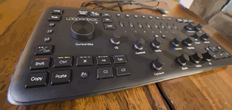
A Christmas gift I received from my parents this year was a Loupedeck+ photo editing keyboard. It allows you to edit pictures in Lightroom (and a some other programs) without clicking and dragging the little sliders.
I had some fun taking pictures of it yesterday and thought I’d share them and my opinions on the different features.
Knobs
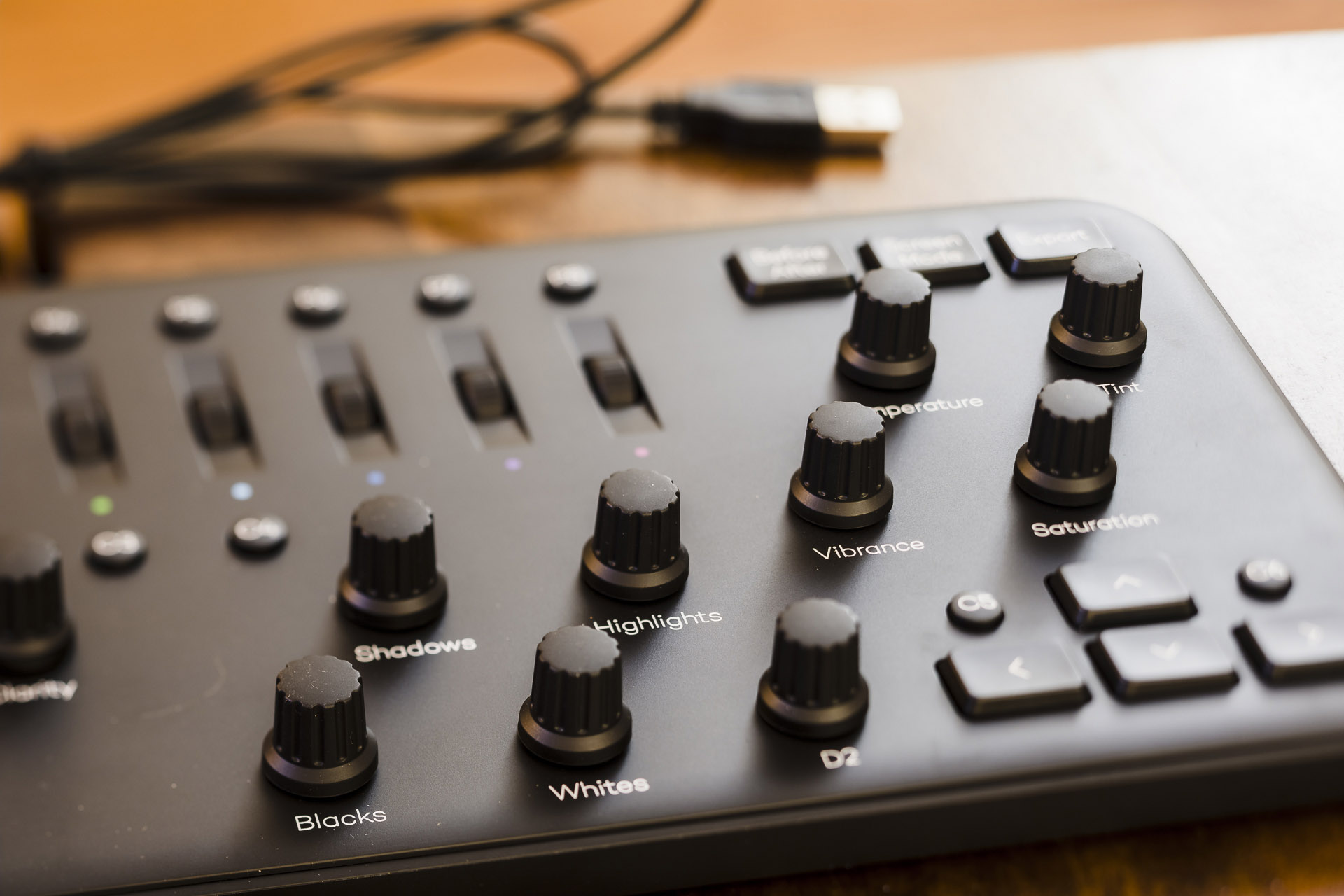
As I mentioned, the purpose of the knobs is to provide a physical interface to adjust the levels in Lightroom without having to use the mouse. The turn on them is mostly smooth, with just a very subtle clicks that are a little more subtle than I would prefer. If you press the knob, it will reset the slider back to 0, which is a nice feature. What I don’t like about them: (1) I find myself nudging them on accident as I work around the board and (2) Each little adjustment as you turn the knob creates an undo point, which makes sense why but I just wish it worked differently.
Wheels
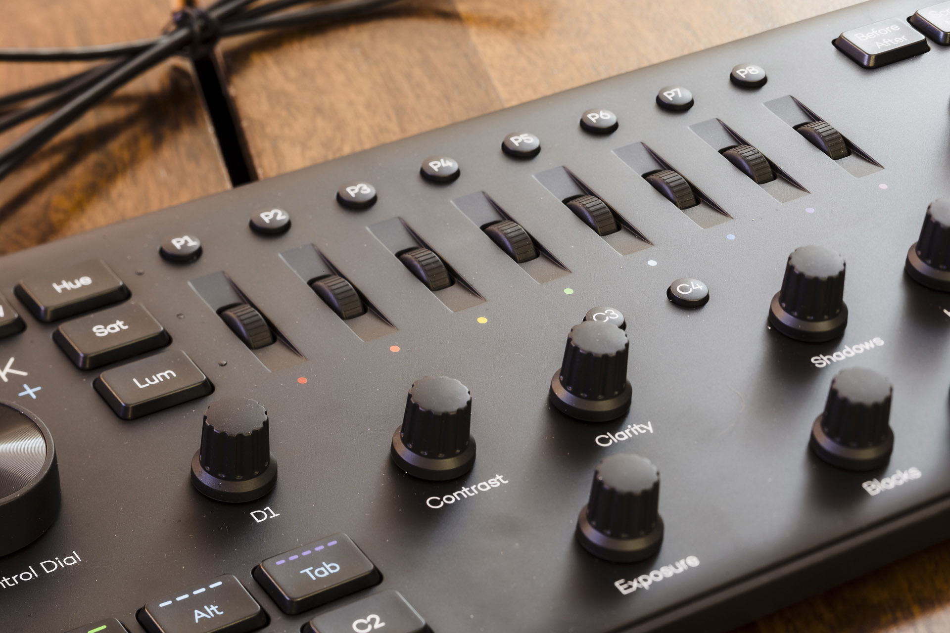
The wheels allow you to adjust the color levels. They have a much clickier feel and sound compared to the knobs. They share the same press-to-reset feature as the knobs. I like that they are recessed and out of the way, since I mostly use a handful of presets and adjust main levels covered by the knobs.
Dial
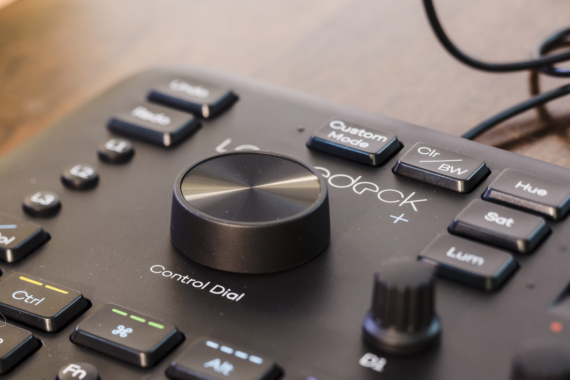
The dial is used for moving between photos (when in the library) and cropping/rotating photos (when in develop). It has a clikiness somewhere in between the knobs and the wheels. It could have a little bit more resistance to it in my opinion, since I find myself sometime over turning it.
Arrow Keys
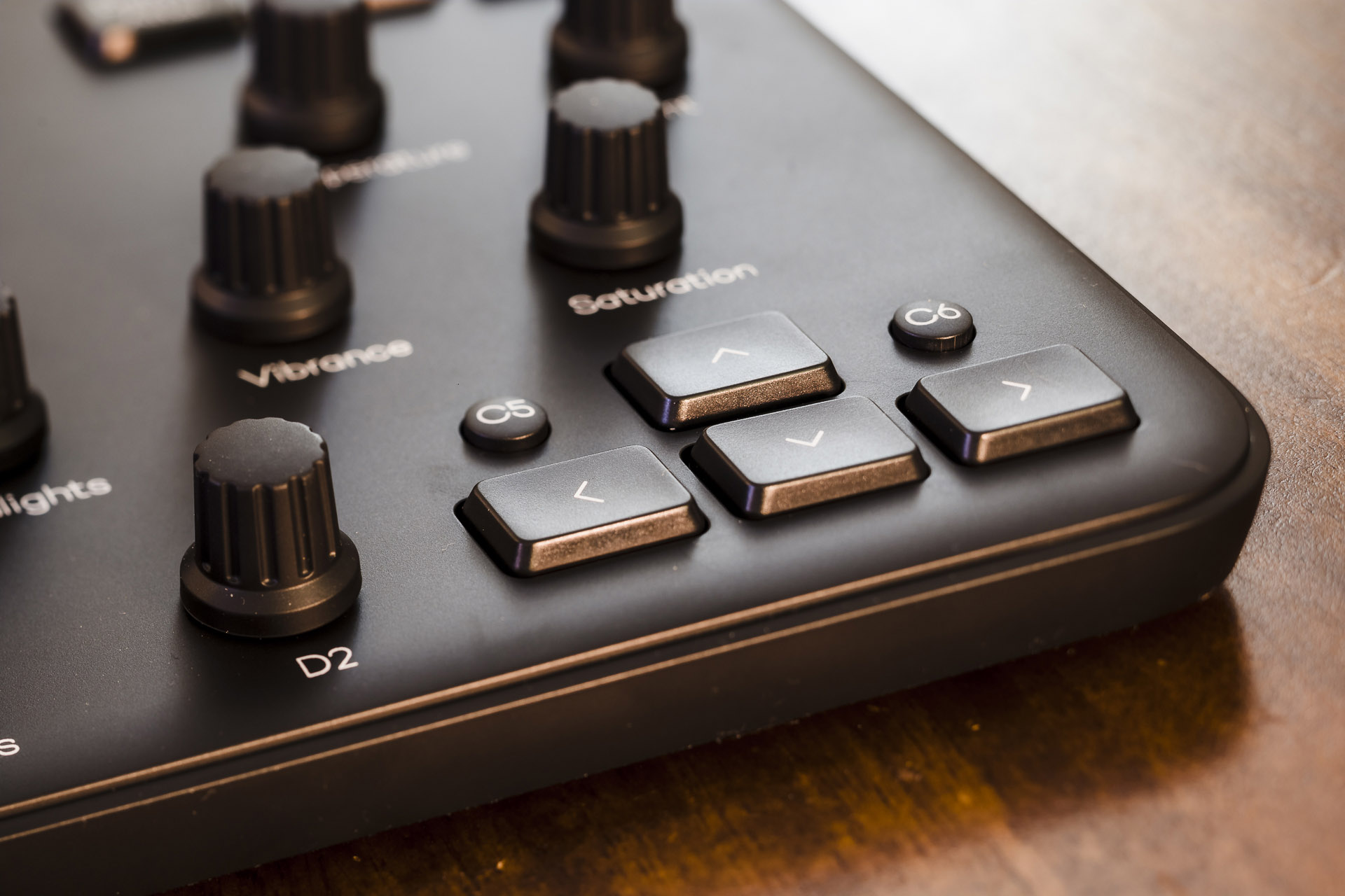
The arrow keys also navigate between photos, and they’re what I prefer to use over the dial because (1) they work in both the library and develop and (2) there are keys for rating photos on the left side, which I’ll get to next. So it’s more natural than squishing both of your hands together on the left side of the board.
Rating Keys
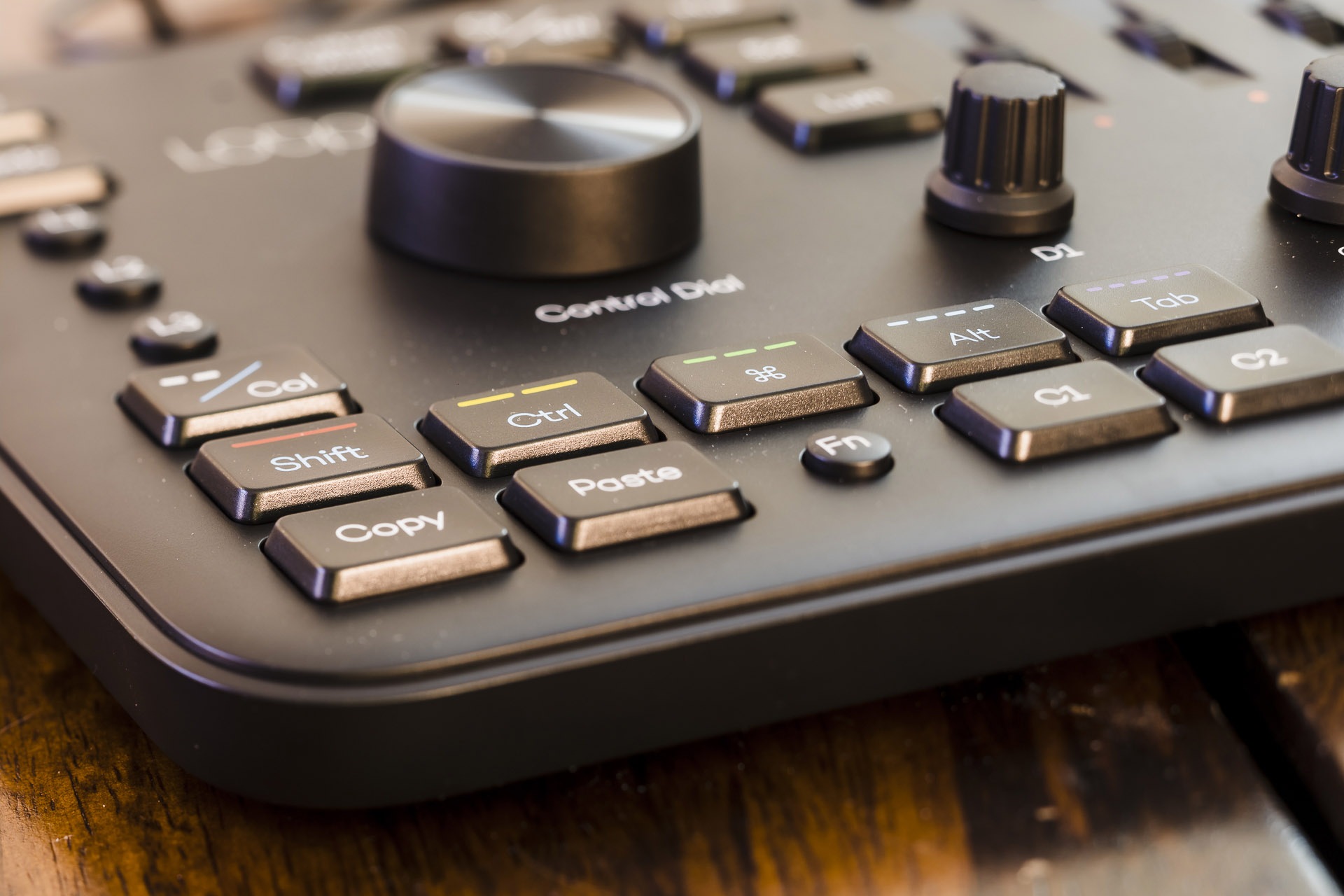
I’m calling this section the rating keys, because that’s what I use them for the most. They let you quickly assign a star rating on a photo so that you can filter through them. You’ll also see copy/paste keys and modifiers. There is a function button that modifies the purpose of many of the keys on the board. What’s unfortunate is that they wobble and my 1 star rating key tends to get stuck/lodged against the case.
Summary
Overall what I like most about this thing is that it exists and it’s pretty well laid out. The quality of the materials is not the greatest, which sucks because it’s pretty expensive. I do really enjoy using it and I’m slowly building up some muscle memory to navigate it properly. I may do a video review later and go more in depth since there’s a lot I didn’t cover. It would also be cool to open it and see it from the inside.
Sounds
Here is a short video of the different switch sounds. You can probably get a good sense of feel and where some of the quality is lacking a bit.
